Flow
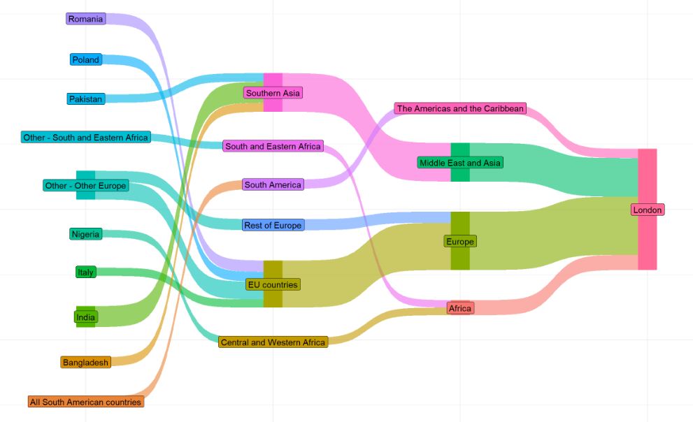
Sankey
Shows how quantities flow between stages or categories, with thicker lines representing larger flows.
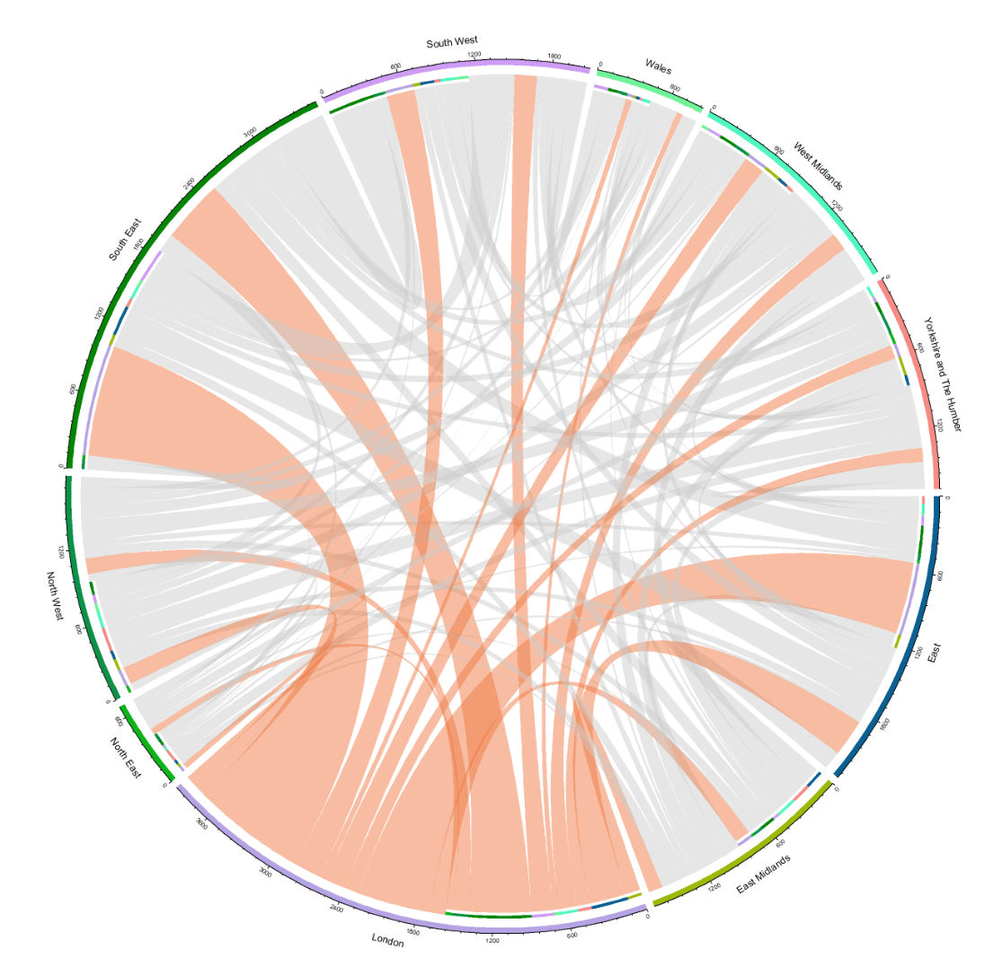
Chord
Visualizes relationships between groups in a circular layout, where connecting arcs show the strength of connections.

Geographic
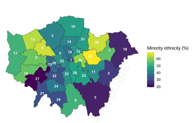
Basic Chloropleth
Displays data across geographic regions using color shading to represent different values.
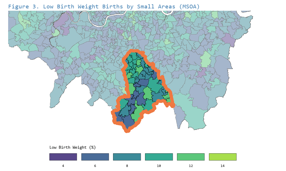
Custom Chloropleth
Part of Whole
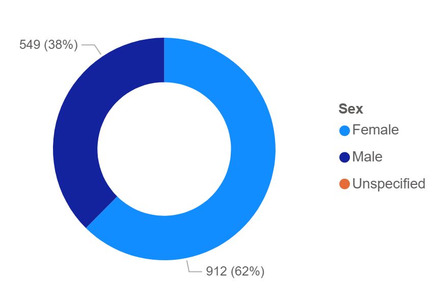
Donut
Shows how a whole is divided into parts, with each slice representing a proportion.
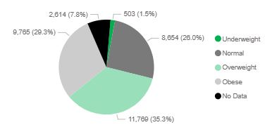
Pie
Shows how a whole is divided into parts, with each slice representing a proportion.
Ranking and Comparisons
Bar Chart
Compares values across categories using rectangular bars for easy comparison.
Line Chart
Shows how a value changes over time or another continuous scale, highlighting trends and patterns.
Custom Bar Chart
Correlation
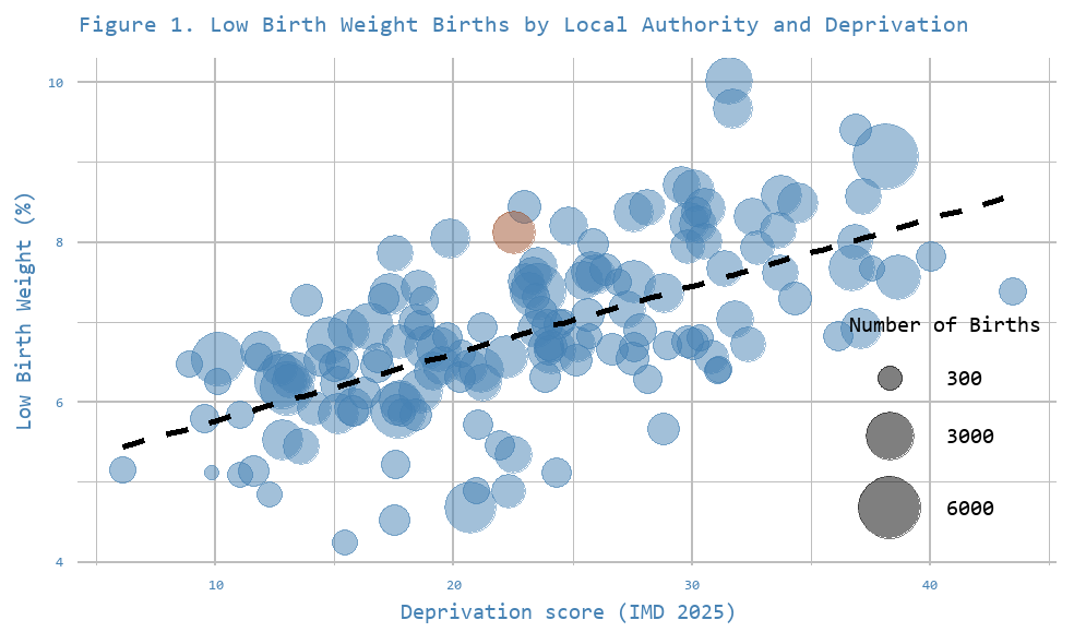
Scatter Chart
Plots individual data points to reveal relationships or correlations between two variables.
Funnel Chart
Illustrates outliers and how variance decreases as sample sizes grow.
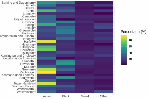
Heatmap
Uses color within a table to quickly highlight higher and lower values across rows and columns.
Distribution
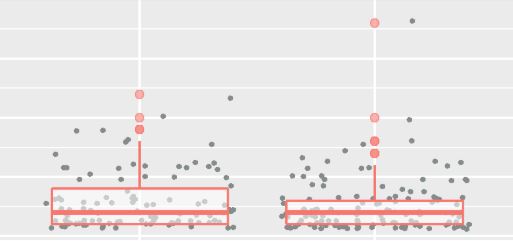
Box Plot
Summarizes the distribution of data, showing the median, spread, and potential outliers.
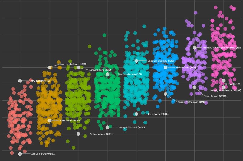
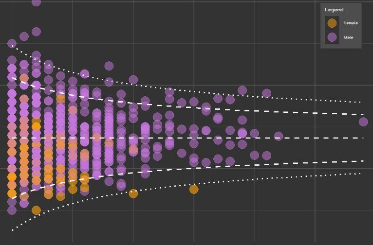
Point Chart
Displays individual data points across categories with slight horizontal spread to show distribution and overlap.
Tables
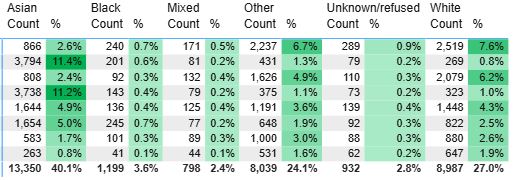
Custom Tables
Present detailed data in rows and columns for precise lookup and comparison.
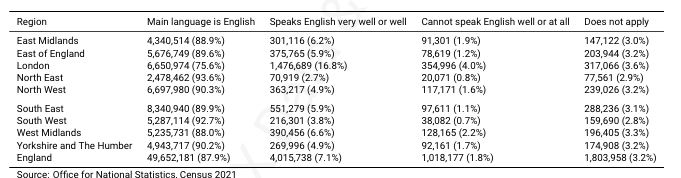
Basic Tables
Present detailed data in rows and columns for precise lookup and comparison.
